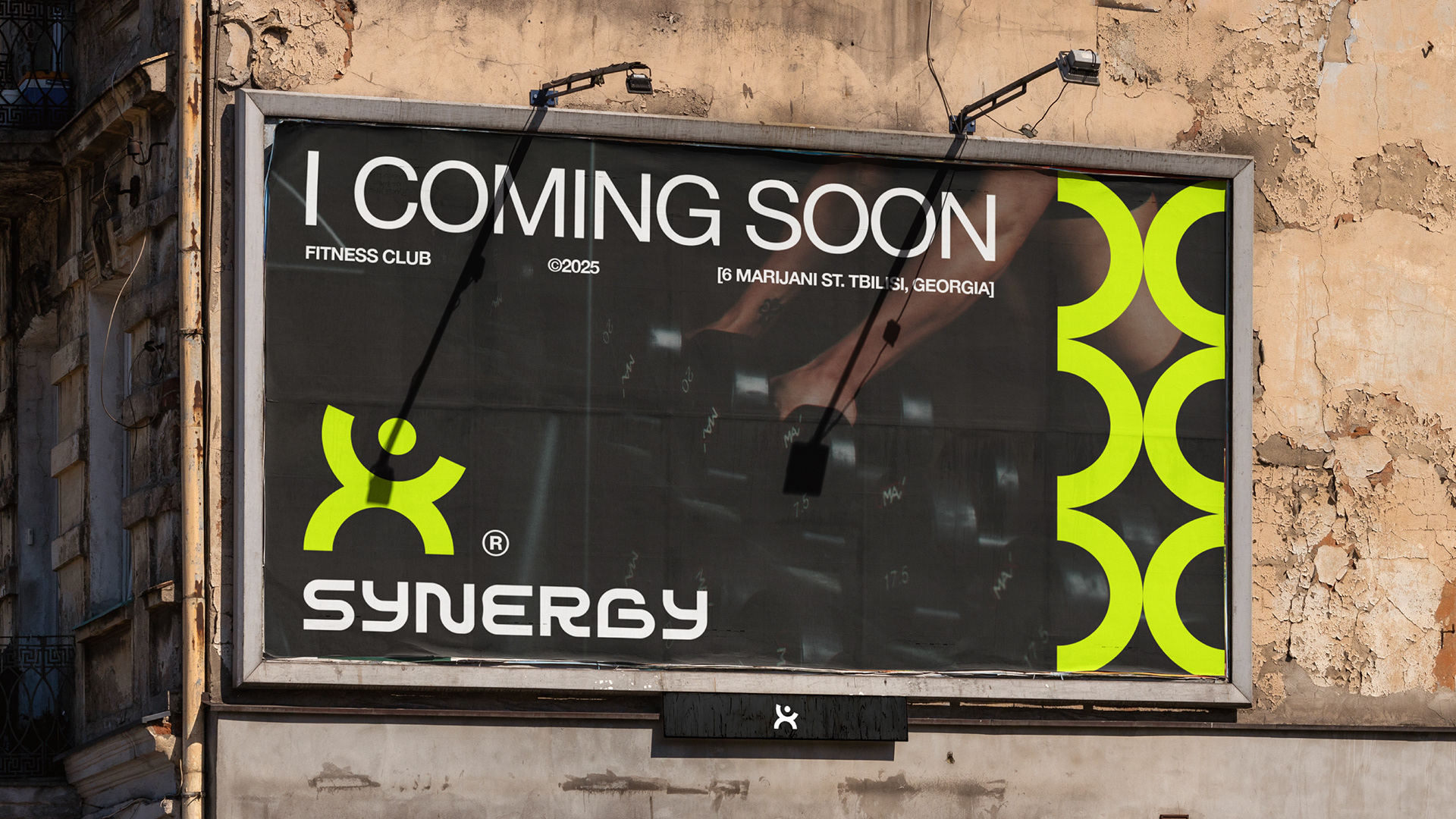
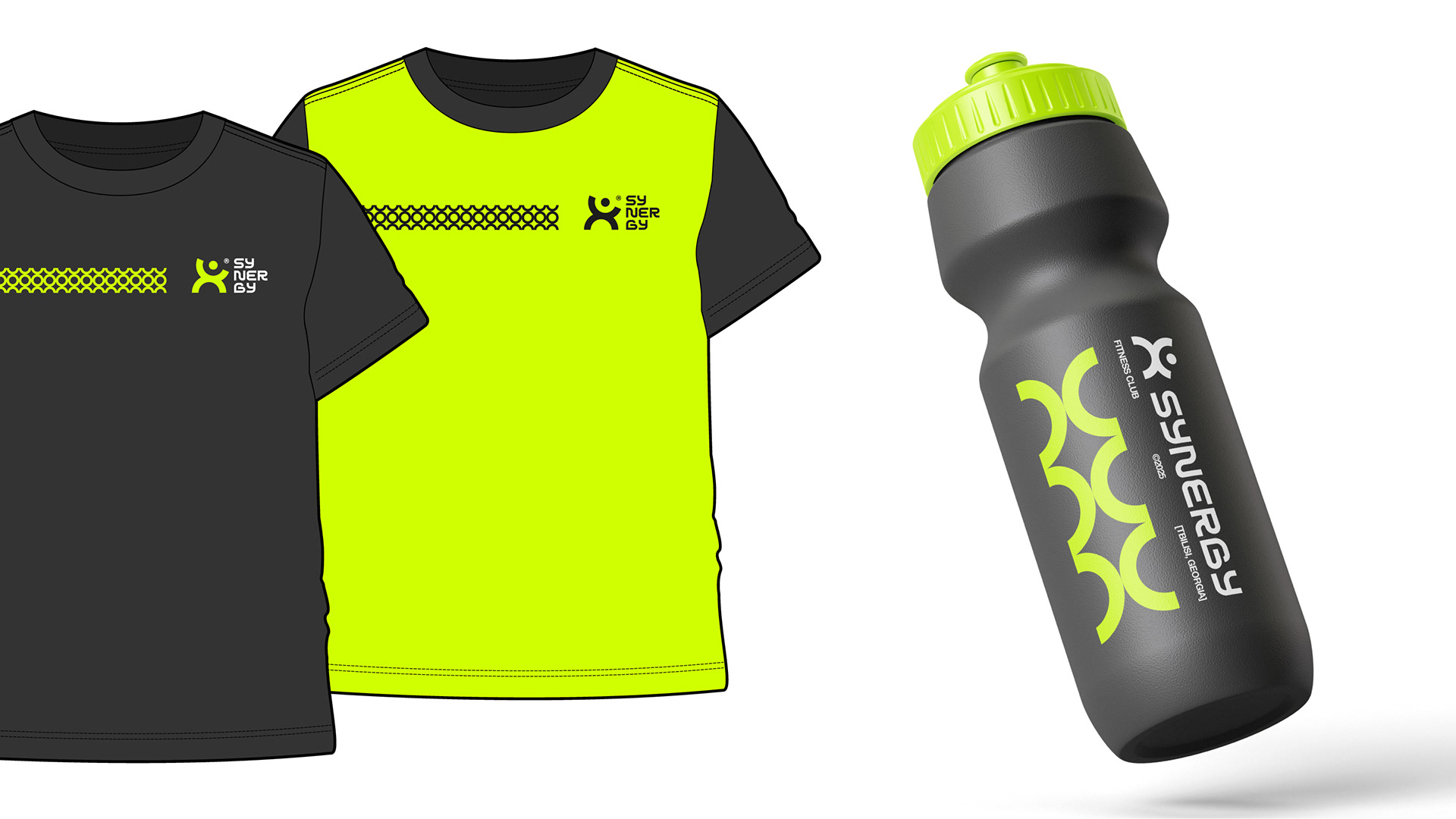
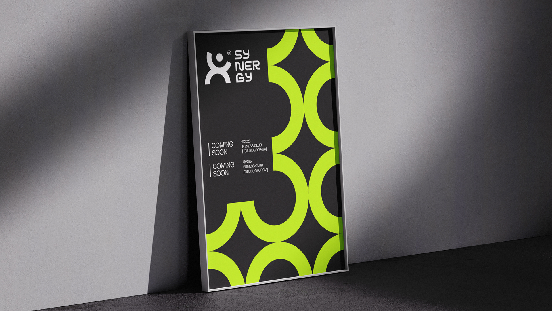
The project involved creating a cohesive visual language that reflects the club’s energy, modernity, and boldness. From the logo and typography to color palettes and applications across digital and physical touchpoints, every element is designed to convey strength, motion, and synergy.
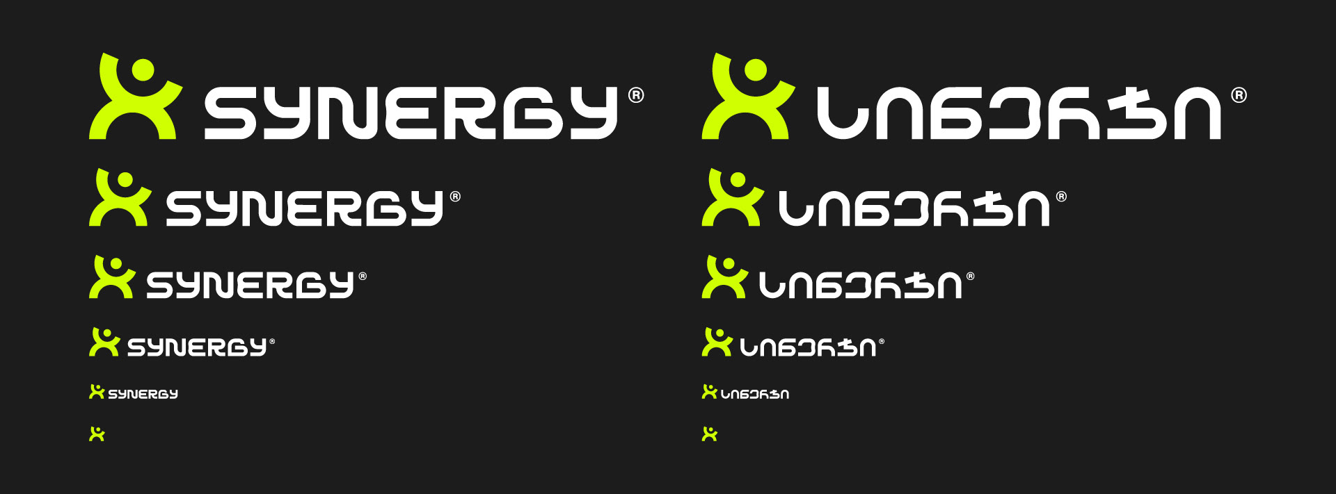
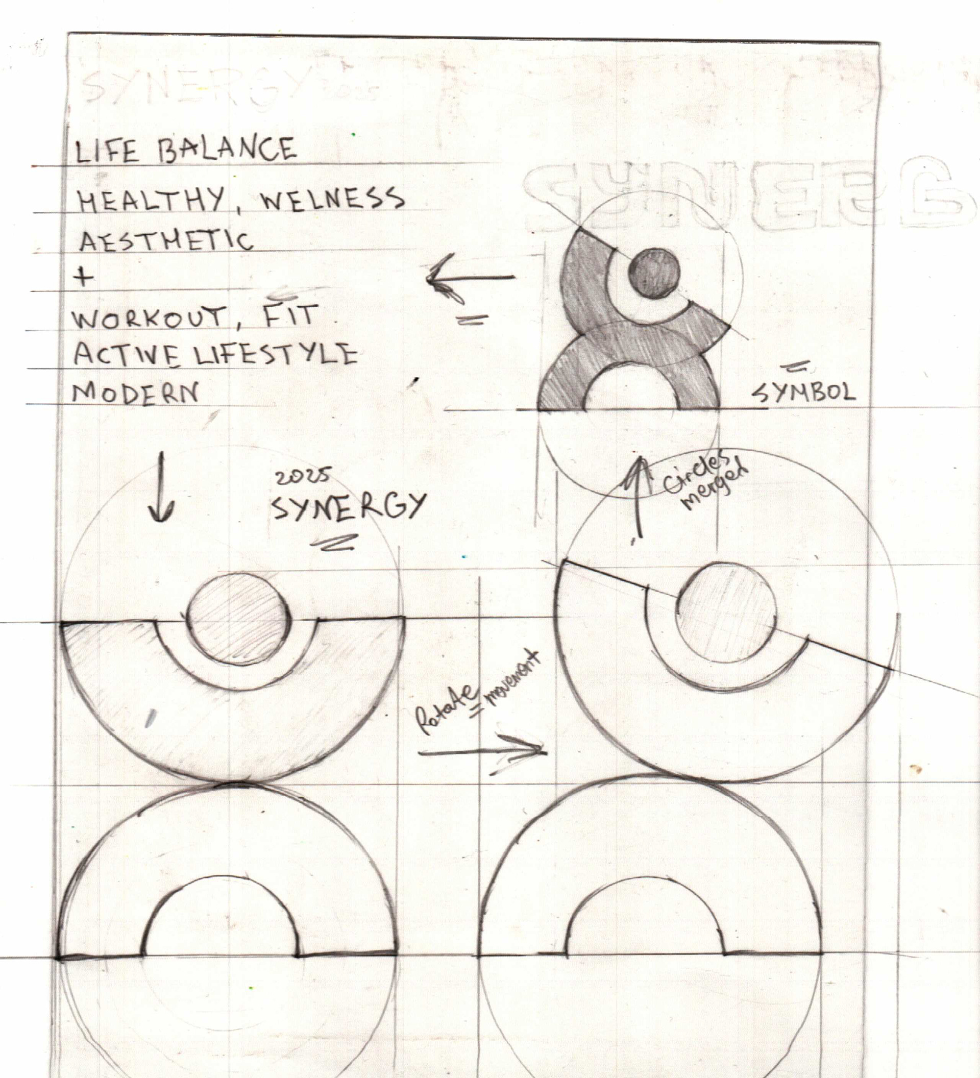
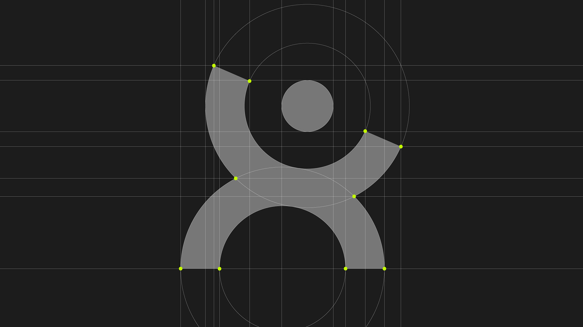
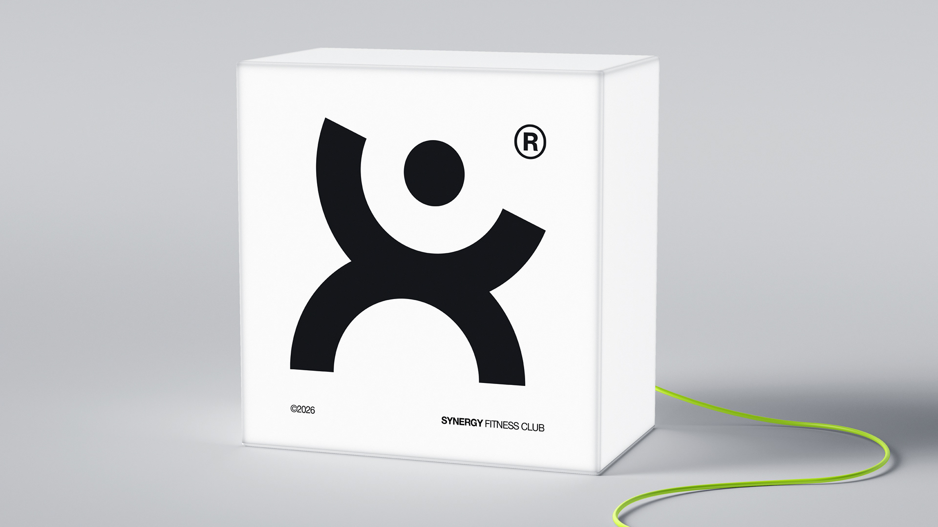
Symbol is built from merged circular forms symbolizing synergy — balance between body, mind, and movement. Rotational geometry and intersecting shapes reflect an active lifestyle, continuous motion, and holistic wellness. The minimal, modern construction emphasizes harmony, strength, and life balance, aligning fitness with aesthetics and a healthy, contemporary way of living.
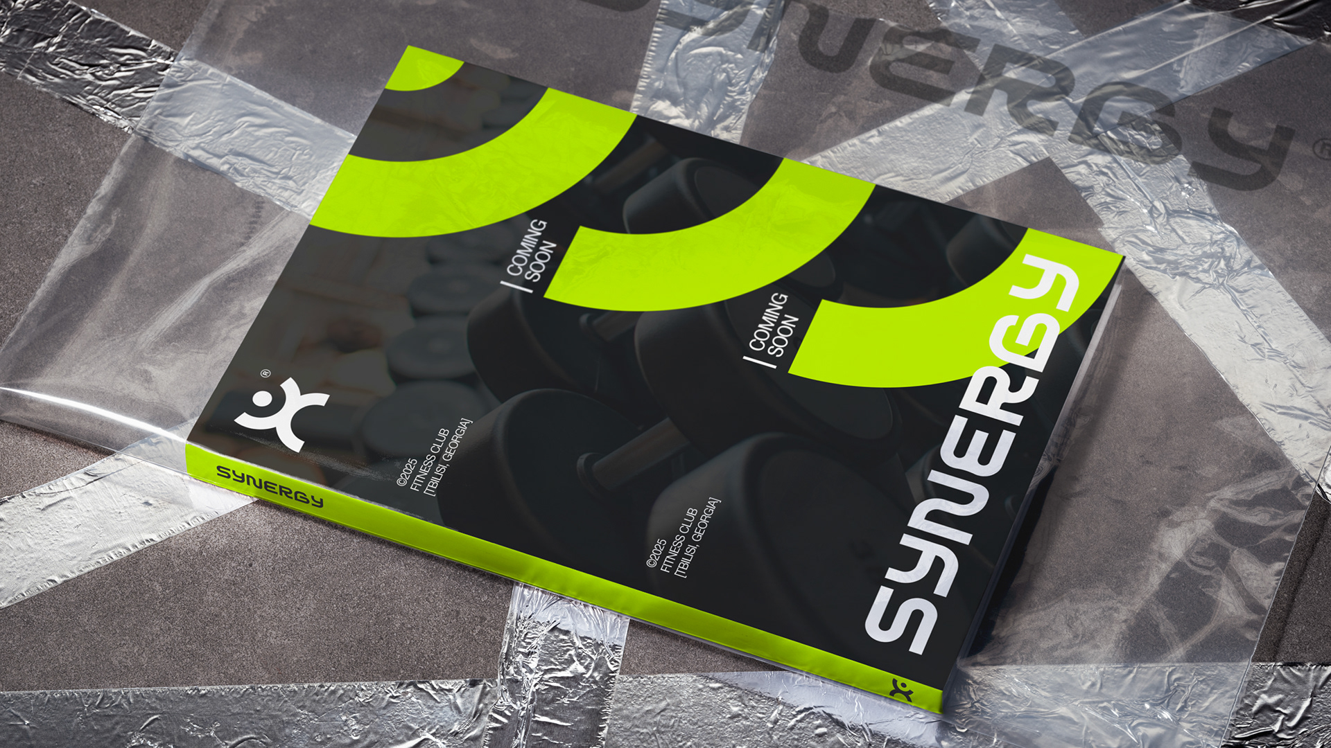
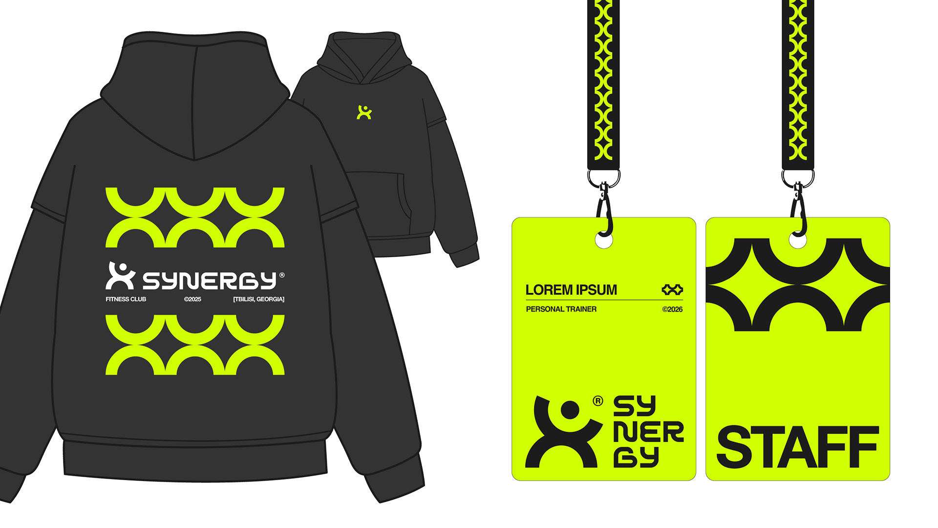
The visual identity is built around bold geometry, high contrast, and repetition. Modular circular elements derived from the logo expand into a flexible graphic system, creating rhythm and movement across large-format applications.
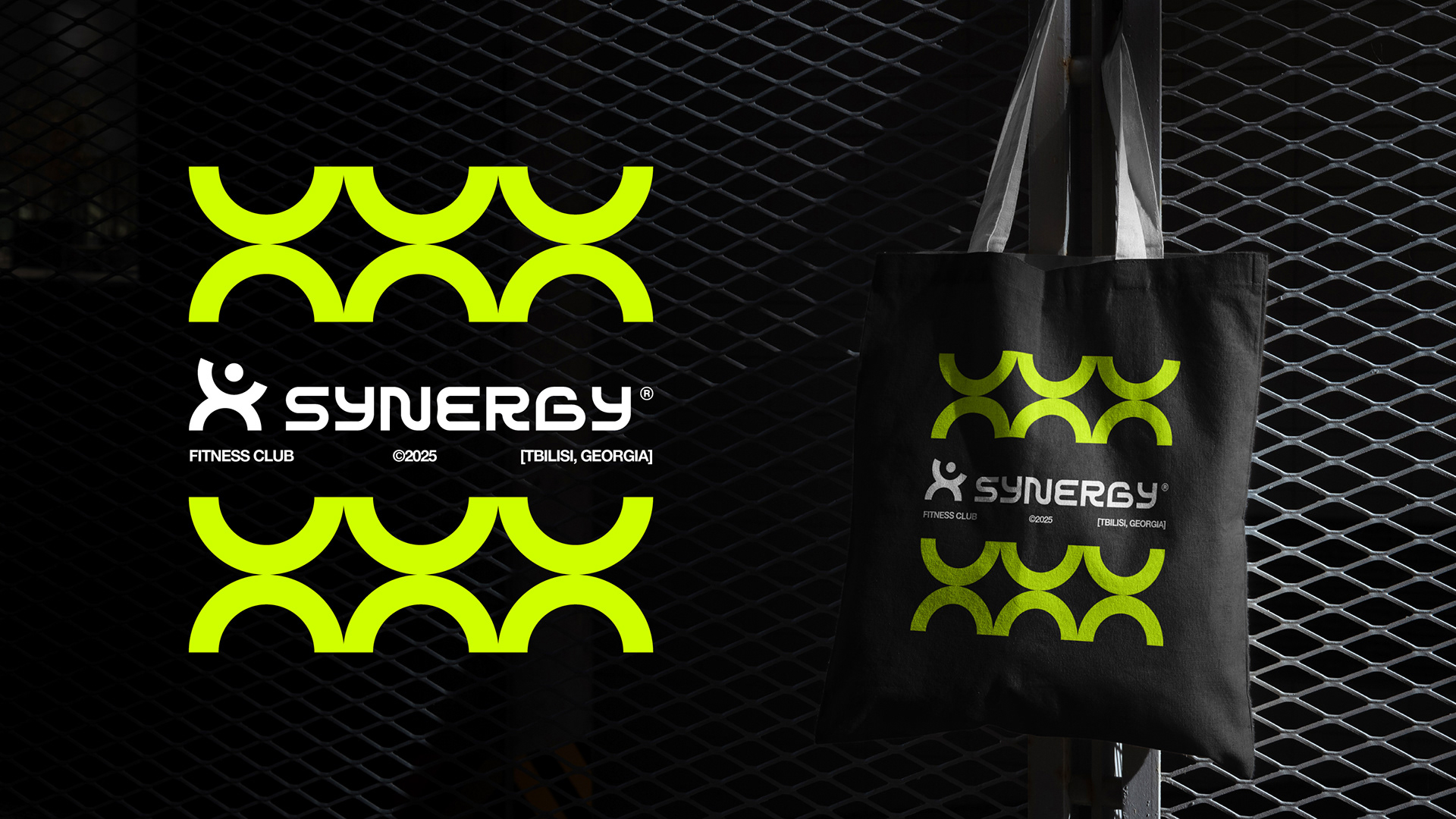
Georgian logotype is custom-adapted to preserve the visual weight, rhythm, and geometric logic of the Latin version. Letterforms are simplified and structurally aligned with the symbol’s circular language, ensuring consistency across scripts.